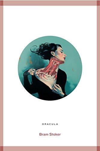
Dracula (Roads Classics) Paperback – 1 Sept. 2014
Product ID: 47900122
Full description not available
L**E
A challenging read
The age of the book meant that it was always going to be quite long winded so I was well prepared to need to skim read some sections. But the story was great, despite not being the sort of thing I usually choose to read (book club choice) and I found myself drawn into the build up of suspense. The ending seemed a little disappointing after the build up but the lead up to it was good.
A**P
Good book
The book is enjoyable to read.
K**E
Addictive and atmospheric
A great read. Love how it is told through diaries and letters. If you love Whitby, the description is fantastic and really adds to the gothic atmosphere of the town. Although Count Dracula is an evil and frightening character, you can't help but feel a little sorry for him! Highly recommend as a must read classic.
D**N
Classic horror
Arrived on time and loving it so far, a true classic.
5**0
Dracula Facsimile: A Nice Reproduction But Falls Short of an Exact Copy
This book has appeal. I bought it 3 months ago and still have a sneaky look at it most day's. But, I both love it & I am a bit disappointed by it at the same time!I first read Stoker's classic when I was 16 and thought it was amazing. For years after I wondered how fantastic it would be if it was republished and bound like the 1st Edition of 1897. That was a couple of decades ago, so imagine how pleased I was when I found this Amazon page.Unfortunately, as it took a while to dispatch, I was so impatient, that, 'caught up in the Dracula moment,' I turned to Google Images to see the original 1st editions. It was then that I noticed some difference's in comparison with the customers uploaded images, which disappointed me a bit and yet further difference's when I received it. I wasn't expecting absolute 100% perfection, but, as 'facsimile' means an exact copy, especially in printed material, I kind of expected something pretty close, even more so because the original publisher had undertaken the project. Here are some of the more obvious deviations:1) 2012 Edition; The front & back cover are authentic enough but, the spine omits the horizontal red lines from the head & foot & looks incomplete without them.2) 1897 Edition; The spine says 'Constable Westminster' in a larger, Old English, font toward the bottom. The 2012 edition has a smaller, uppercase serif for, just, the publishers name only. The Old English font typically mirrors the Gothic Revival style of the time. So, I wish they had stuck with the Old English one for 'Constable' instead.3) 2012 Edition; On the spine there should be a line space between Bram & Stoker and the author & title lettering should be a bit lower down.4) 1897 Edition: The main title page was quite different. Although a very similar typeface has been used, the 1st edition had a good few spaces below the title, before 'BY', & the word 'BY' is in a much smaller point size. A couple more line spaces, again, before the author's name, about half the size of the title. Also, the title had wide kerning: D R A C U L A. This should have been a page to get spot-on but, sadly, the 2012 edition doesn't really follow the original page layout that closely.5) 2012 Edition: Page 1, Chapter 1, the heading is smaller then it should be and the sub headings larger. Although, the main page text looks typeset exactly right with the wording on each line starting and ending, before returning to the next line as the original.6) 2012 Edition: Is about 1cm thicker in depth then the 1st editions, which were described, on Abe Books.com, as just over an inch in paper bulk. Which would explain why the title and author lettering doesn't touch the edges of the spine as the on the 1st edition's. So a thicker paper must have been used.7) 1897 Edition: All 3 sides of the page edges were not guillotined smooth. On the 2012 edition only the front edge is decked. As this book comes in a slip case it might have looked better if they had made all 3 sides uneven too.As the design is so straightforward, I find it difficult to see how gaffe's were made on this edition, which makes the use of the word 'facsimile' questionable. I assume they are deliberate, to set the two apart. I would have expected Constable to have made a point of saying they have painstakingly studied and researched the original, but, if they did, they have also made changes. Clearly this is more a loosely based modified imitation, than having more impeccable attention to detail.In Amazon's "Look Inside!" feature the colophon page says 'Printed & bound in the UK' but, my book says China, lol, you wouldn't have seen that back in Stoker's day, a sign of the times I guess! And if I'm honest, I could live without the introduction from Colm Toibin. Stoker's reproduced contract is great to see, but, putting a thin white border around it makes it look like a good quality colour photocopy. I can't understand why it wasn't bled to the edge.There is a facsimile paperback version, released by the same publisher, as well, with same style yellow/red artwork. The first ever paperback edition was also by Archibald Constable & Co Ltd in 1901. It had new artwork which included navy blue typography and dividing lines around a sketch of Dracula scaling down the castle wall, as Harker looks on from a window above. It was the first ever illustration of the vampire which was officially approved by Stoker himself. The paperback contained a new introduction by the author who also self-abridged the story. It would have been fantastic if Constable had used the initiative to bring this 1901 softcover back to life, instead, as an authentic facsimile and an alternative to the Limited Edition hardback. I'm sure I wouldn't have been the only one to have bought it as well as the hardcover replica. An opportunity missed?Furthermore, the thumbnail image used by Amazon, via the Constable & Robins website, is an inexact example of how the 2012 & 1897 front covers should look, by apparently using a picture of a morocco-leather rebinding of the 1st edition (replacing the original yellow cloth). Although in keeping with the style, the title and author are shown lower & reduced within the red lined border, rather than over-lapping it, as illustrated correctly here in Amazonian's pics, and the 1897 1st editions on Google Images. How this happened is anyone's guess.However, all things considered, this is still a lovely cloth-bound, deckle edged, book in a sturdy slipcase and a joy to behold, and you're not going to get anything closer. OK, I know this couldn't have been exact as it has the Toibin introduction, but, I think there are too many changes to be passed over, &, for me, it kind of defeats the object. It would have been much better if the spine was given the detailed finishing touches it lacks, in particular the integral horizontal lines & Old English font for the publishers name, also, an authentic title page layout should have been a must. There is already a Limited Edition 1 of 1000 numbered title page in addition to the actual title page. This should be more than enough to distinguish it from the original, never mind altering the main title page as well. What happened to standards? Most people wouldn't know any different and neither would I if I hadn't looked on Google. I'm not a book specialist, I have no idea if most 'facsimile' book's are more precise or not. But, if there were fewer inconsistencies it could've been the dogs doodahs with still enough distinction between this and the original.
D**Y
Larger clear font format, metallic detail on cover
Given as present for dyslexic person who can now comfortably read this classic and is able to concentrate on the story rather than struggling to get meaning from print. This may be of help to refuced vision person, but check that out.Font is easy, size good, beautiful looking book clothbound with sparkly inlay. Lovely all round!
T**N
A classic
Well, I’m a bit of a horror nut, so I’ve seen countless adaptations of Dracula over the years and was pretty familiar with the story before I started reading. That said, I’m going to be forty next year and I’ve made it my mission (note: not New Year’s Resolution because (a) it’s November, and (b) I don’t believe in them) to read a whole load of classics over the next few years so as to ensure if anyone makes an oblique reference or an obscure quote before I’m fifty, I’ll recognise the sucker.Hence, Dracula. Written in the form of notes, journals and diaries, the story follows Jonathan Harker - an English estate agent, finalising the sale of a house to a reclusive Transylvanian Count. Up in the Carpathian Mountains, young Harker finds himself ensconced and then trapped with the sharp-toothed, gaunt and lanky Count and his harem of undead lovelies, hoping and praying to return to his beloved Mina, unadulterated and in one piece.But as fate and real estate would have it, the Count is bound for an England unaccustomed to his bloody, somewhat carnal desires (I’ll remind readers that this was published in 1897 and the world has altered rather), and only Harker, his intended, the other men who wanted to marry her, and a Dutch doctor, Van Helsing, have any hope of stopping the monster.A rip-roaring tale, highly gothic and suspenseful despite the multitudinous film and TV adaptations on the box at this time of year. I did struggle a fair bit with the phonetic-writing in parts of the book. Some of the minor characters speak with various broad accents which are written as said. Although an aid to local flavour, this, coupled with Dr. Van Helsing’s rather broken English left me occasionally bewildered.That said, it’s a classic and everyone should read it.
S**L
Worth it
Worth the read, after watching so many films of dracula to see where it begin.Would recommend 100% to all book lovers
Trustpilot
1 week ago
1 week ago
2 weeks ago
2 weeks ago