
Desert Online General Trading LLC
Dubai, United Arab Emirates
Desert Online General Trading LLC
Dubai, United Arab Emirates

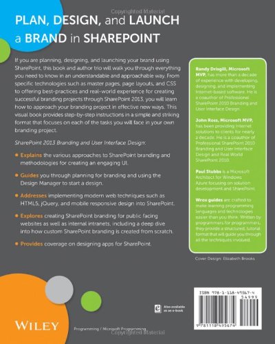

SharePoint 2013 Branding and User Interface Design
P**2
Practically helpful, complete, full of examples and illustrations
This is exactly what I needed. It offers a large amount of information on the topic of SharePoint branding, and it includes an easy to follow, very helpful tutorial for implementing custom branding from start to finish.
C**Y
Great For Newbies
I have lots of SharePoint experience, but had never done much with branding (html, css). This book was recommended to me by a programmer when I was assigned a branding project at work. I love this book, it gave me the base knowledge to get started on the project and I have used it extensively. I highly recommend this book, especially if you are migrating to 2013 and are new to customizing SP.
B**A
Good read
Good read for those looking to do some customization in SharePoint 2013
M**B
Five Stars
Great
M**L
... far into the book yet but so far it's easy to read and understand
Haven't gotten to far into the book yet but so far it's easy to read and understand, highly recommend for newbies.
S**S
A must have!!
This book is a must have for any SharePoint Professional. If you're an Admin it will give you great insight and if you're a developer it will bridge the gap to SharePoint Branding! It's a great add to any SharePoint Library
G**Y
An amazing book on SharePoint branding and UI design
Not sure where to being with this review other than to say that this is an amazing book! Full color images really drive home what you are doing and, I think, makes it much easier to understand. It is one thing for a book to say doing X will give you Red text but then to see the actual results in red text makes it much better.The only bad thing I would have to say about this book is the layout, but I feel that is more because I am a developer rather than a UI person. Whenever I show it to my artist type friends they all love it and really the book is more for their types than mine :)
S**A
Excellent resource
Best resource for branding, with practical exercises to master concepts and enough depth to allow you to reverse engineer and modify for your own projects. No other resource comes close to this quality, this book is well-written and thorough.
M**N
Great Book, but let down by poor Kindle version
The written content of this book is excellent and highly recommended. The Kindle is a poor implementation with very pixelated screen prints, that are often unreadable. The font chosen for displaying code is too large compared to the font of the main text so that code examples are spread over many pages on an iPad, making it harder to read. All in all a great book let down by a poor implementation on a Kindle.
C**N
Überragend guter Guide für interessierte SharePoint-Admins
Gekauft habe ich mir das Buch, da ich nach einigen Jahren als SharePoint- und allgemein Server-Administrator das bisher umschiffte Thema "Design und Branding" angehen wollte, bzw. musste. Da Microsoft keine passende Schulung anbietet, die sich wirklich nur auf das reine Branding des UIs spezialisiert, habe ich zu diesem Buch (mein erstes in der Richtung überhaupt - normalerweise kaufe ich keine Fach-Bücher) gegriffen.Bereut habe ich es nicht. Es ist alles angenehm klar und deutlich formuliert. Es wurden keine unnützen Umschreibungen verwendet und der Inhalt ist gut vermittelt. An Hand des User Guides konnte ich mein erstes vollständig nach CI-Richtlinien gestaltetes SharePoint 2013 Design publishen.Daher: 5 Sterne - empfehlen kann ich es für alle interessierten. Dennoch sollten zwei Dinge auf jeden Fall mitgebracht werden. Zum einen zumindest ein wenig Verständnis von HTML, Javascript und Co (ja, auch als üblicher Server oder SharePoint Admin) und die Fähigkeit englisch-sprachige Texte lesen und verstehen zu können.Viel Spaß damit.
E**I
dove andare a sbattere la testa quando bisogna mettere le mani al design di un portale SharePoint 2013
Mi servivano delle dritte su come mettere le mani sulla master page di SharePoint 2013 in modo da adattarla alle desiderate. Mi ha fornito ottimi riferimenti. Consigliato
C**N
Pesimo
Pésimo, mal libro, no lo compren, no trae nada de diseño, es menos que básico, mal libro, eso es todo
S**R
It's (almost) all about appearance
Sharepoint is Microsoft's collaborative application development platform, designed to provide an integrated set of web technologies supported by a common back-end technical infrastructure. Acting in concert with the company's various Office products, It is intended to enable the provision of a whole series of collaborative work space types - internet portals, document and file management environment, extranet, collaboration environment, meeting management, etc -- with minimal development work.Sharepoint can -- and indeed is intended to be -- used 'straight out of the box', with full and unfettered functionality available at all times and rapidly configurable through built-in libraries of site templates. Whilst this approach allows for maximum leverage of the product, the package's inherent complexity and the need to understand the entirely non-intuitive back-end database and work-flow paradigms make for a steep learning curve for any developer new to the product pretty much regardless of background. Unfortunately, the same steep learning curve is often imposed on end users of Sharepoint sites because by default these are so feature-rich and confusing to navigate; just about the biggest challenge for the Sharepoint site developer is to produce a site that is not so complicated to use that would-be users are immediately frightened away by its impenetrable array of options. Not for nothing has the product been renamed 'Scarepoint' by most users in the trade.Enter, then, "Sharepoint 2013 Branding and User Interface Design" by Randy Drisgill, John Ross and Paul Stubbs. Despite the way it is presented and marketed, this is not a beginners' book to Sharepoint, largely because it does not dwell at all on the scope and applicability of Sharepoint, nor does it spend any time explaining its underlying operational paradigms. Rather it concentrates on how to manipulate the look and feel of a Sharepoint site, shaping its appearance to better match the functionality that is required -- an aspect of Sharepoint application development that has largely been the preserve of the advanced Sharepoint professional up until the release of Sharepoint 2013. The book is therefore of value to any developer of collaborative web environments looking to exploit the power of this ready-made solution whilst maintaining full control over the user interface that it presents.In keeping with its subject matter, the book is no light read. At over 400 pages in length and using a tightly-packed font for the main body of the text which is quite a challenge for old eyes, the authors pack in a substantial amount of material, covering just about every aspect of appearance design and customisation available within Sharepoint - and these days that's a lot of material! Far from being turgid though, the material is highly readable (if you can see it) and remains firmly grounded in practical real-world applicability whilst providing lots of examples and hands-on practice material, with plentiful illustrations and figures to break up the reading.So, if you've ever struggled to try to make Sharepoint sites look less like Sharepoint and more like something that you would actually be prepared to share with anyone, this is definitely the book for you. It should probably become an essential part of every serious Sharepoint developer's arsenal of support materials for creative and usable site development. If you are wondering what Sharepoint does, though, and whether or not it is the right tool for your next web project, you'd do better looking for a different sort of book in the first instance, such as " Beginning SharePoint 2013: Building Business Solutions " or " SharePoint 2013 For Dummies ". Beginning SharePoint 2013: Building Business SolutionsSharePoint 2013 For Dummies
Trustpilot
1 month ago
2 months ago