Dracula


J**H
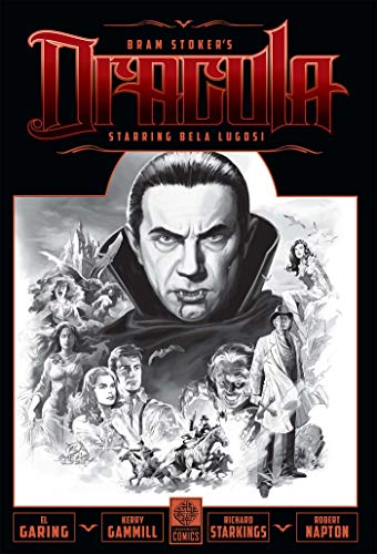
Lugosi returns!
Brilliant art work that showcases just how good Lugosi could have been given the original story. The book however differs ever so slightly from stoker's classic, as Whitby Abbey and Carfax Abbey for some reason are one and the same place. (Whitby). Why the writers have used Whitby for the principal setting rather than London is a bit of a mystery, but this is a piece of work that any Dracula fan must have. Excellent.
A**.
A great adaption of a classic book
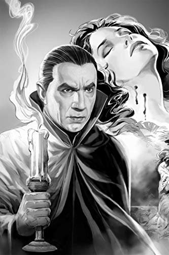
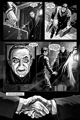
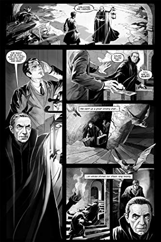
A great addition for the library of anyone who loves classic horror stories and graphic novels. A lovely book beautifully illustrated and wonderfully written. The black and white images add to the atmosphere of the story, especially with the title character being in the image of Bela Lugosi. Originally Universal Pictures intended to film a more lavish version of Stokers novel, one mire closer to the original story. However the Wall Street crash of 1929 and the Great Depression that followed forced the studio to adapt a much less expensive stage version. What we see in this adaptation may well give us a insight as to how it may have looked had Universal forged ahead with their original plan.
H**7
Must have for a dracula fan
A birthday present for my dad who loves bela lagosi and both he and I wernt disappointed. Must have for a dracula fan
D**M
A lovely adaption of the novel
The art is gorgeous and the adaption is well done they even give a more gory ending to Dracula. A shame it's in b/w in color I'm sure they'd sell way more copies. There's a reason there's only one b/w magazine and 100 plus color magazines
P**V
Amazing Illustration!
True to form! Love this! Amazing art work!!
Trustpilot
1 week ago
2 days ago