
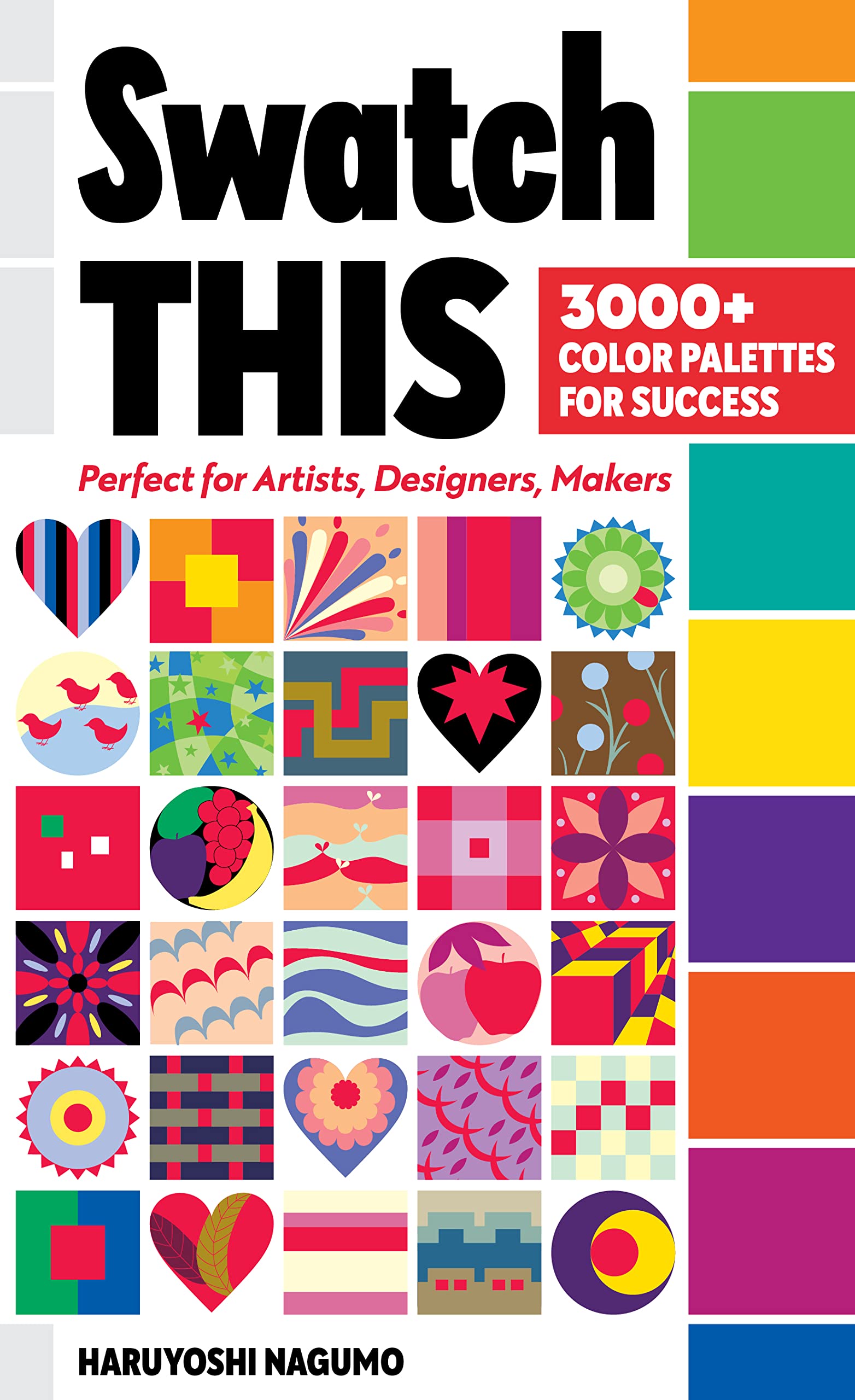

Swatch This, 3000+ Color Palettes for Success: Perfect for Artists, Designers, Makers
3**T
The BEST book about color
Lots of research went into this book. Very well organized and comfortable to hold in your hands. There are incredible color combinations you could never believe go together. I love the fact this book is also a spiral book. You will not be disappointed with this purchase. It will become your first book when researching color combinations.
M**D
Lots of information
There was lots of interesting information but not what I was looking for so I returned it. A well thought out book, lots of research and illustrations.
C**B
Colorful and Educational!
This fun and colorful book is going to come in so handy during my creative process. The happy color combinations bring me joy. If you like color, this book is for you!
B**Y
FYI: Has a nice Spiral binding!
I literally just received this, so can’t yet fully comment on its usefulness (though it looks beautiful & is set up really great at first glance, so I’m sure WILL be very useful!). I mainly wanted to note for anyone buying that it is spiral bound, because I could be wrong, but I don’t think it’s mentioned anywhere in the description. For me this was a huge plus, I had actually wished it was bound like this to begin with so was pleasantly surprised when I saw it actually was!
B**R
Love this book!!
Fun and inspiring. So many color theory books are overwrought to the point of boring - this book is perfect in all regards. Highly recommend!!
N**.
Excellent color tutorial.
I was shopping for a color wheel when I came across this book. So happy I found this! Beautifully illustrated with terrific color combinations. This was exactly what I needed.
L**.
A fascinating color resource
This is surely one of the best, most serendipitously useful, books on color I've found. Along with extensive, concise and thoughtful descriptions of color 'correspondences', emotional charges as well as visual dynamics, it offers a wonderful opportunity to consider differences/interplay between East/West responses to color. I refer to it when starting a new abstract painting, and it's indispensable as inspiration in my textile designs.
G**S
Great Information!
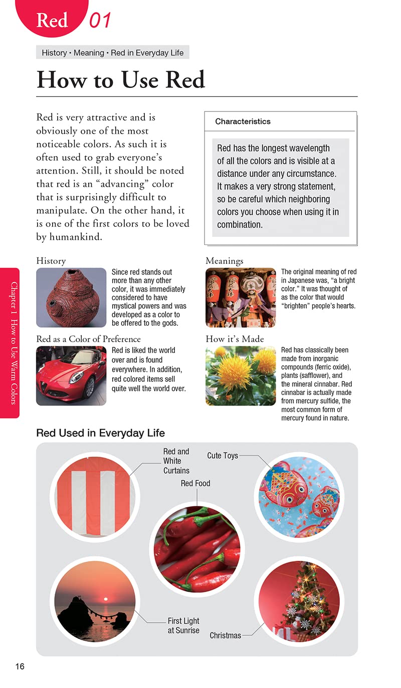
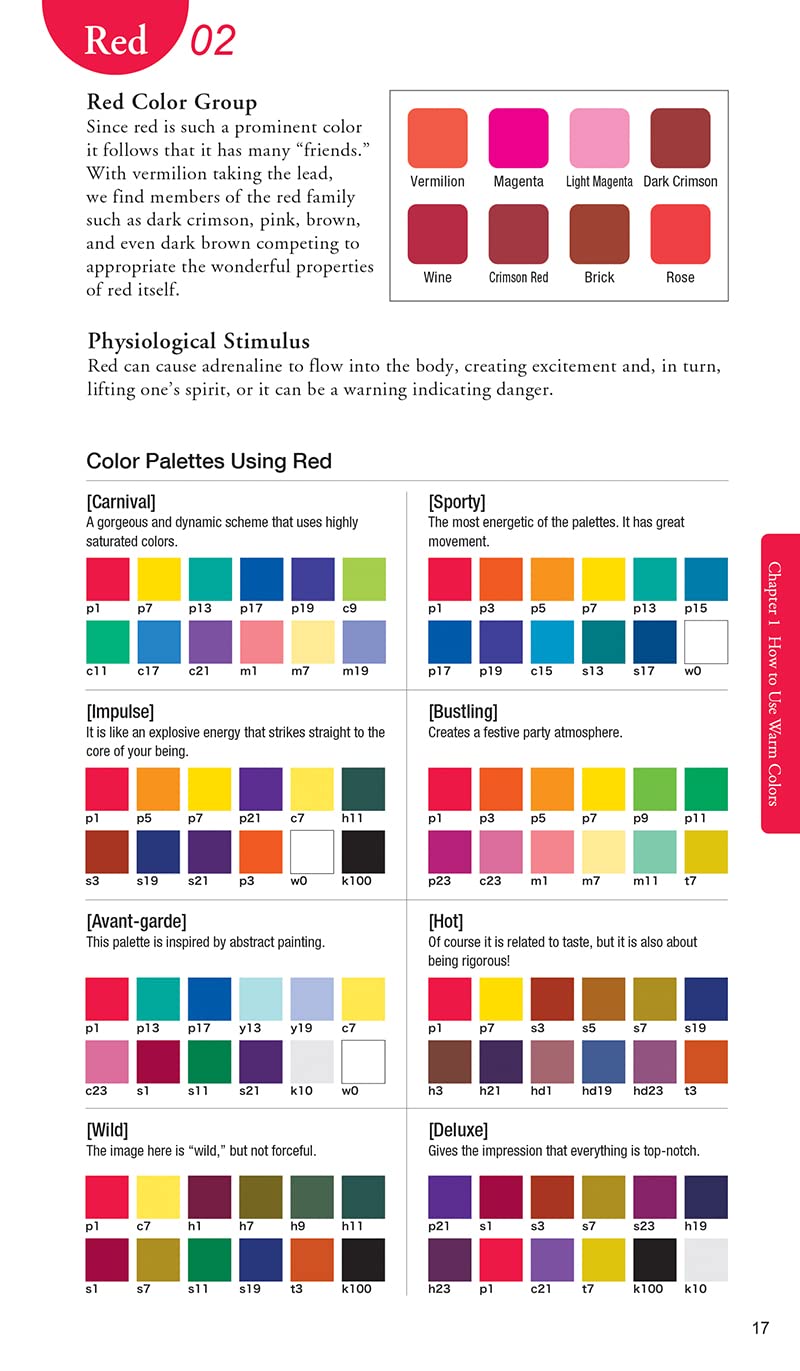
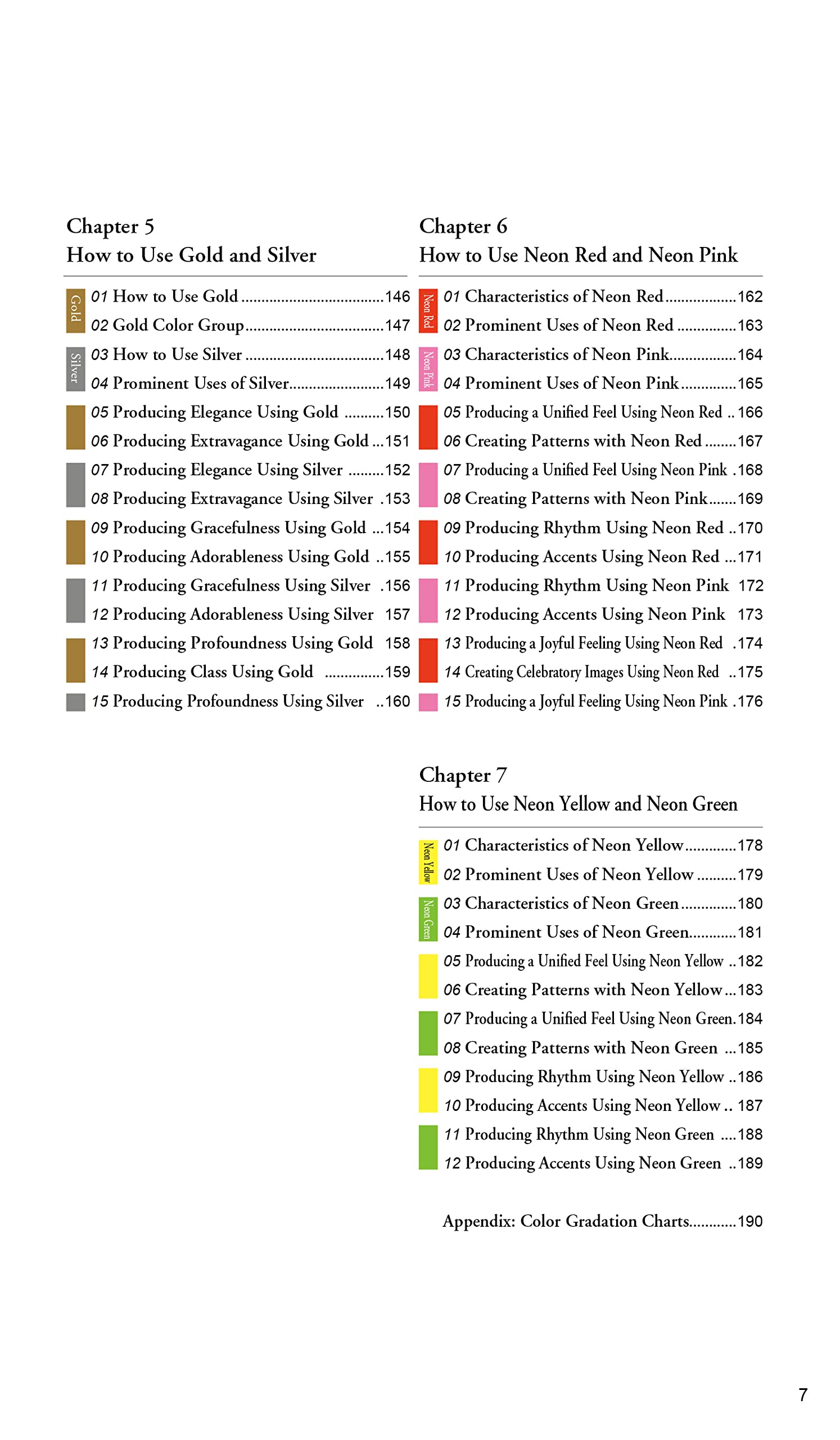
I love colors and I love quilting and the more colors the better in my quilts. Most books on color for quilters urge you to study if not make a color wheel out of fabric. Making a color wheel out of solid fabric shouldn't be a hard task, but making a color wheel with prints is a different story. A printed fabric may have large amounts of 3 colors then varying amounts of other colors. Depending on how you look at the colors and what you snip out, you can make one print fit into just about any spot on the color wheel. So I don''t use color wheels. When I buy fabric at full prices (like at a regular fabric/quilt store) I tend to always buy floral prints unless I know I absolutely need a certain something to use in my quilts, like a very light white or cream print. Where my fabric color knowledge has grown over the years is at my local thrift store where for years a fat quarter would sell for 25 cents and a yard of fabric for 50 cents to a dollar. At that price, I throw all the quilt fabric into my basket and take it home. Once home I hang it on a wooden dryer rack for about a week to get rid of the smell that thrift stores have to spray on fabric. So for a week I see this fabric hanging on the rack and I get familiar with it and see, things I hadn't noticed. Then I cut the fabric in my usual pre-cut sizes so it is ready to go when I need it to. The next thing I know I am setting up a quilt block and using one of the pieces I had picked up at the thrift store. I wouldn't have picked up the fabric for $8/yard, but I got it at 25 cents and it is so perfect in the block, I wish I had more.This is in a way what this book is about. Instead of a color wheel with only warm and cool colors, her books shows 8 different palettes for using with the color. She also gives the same amount of space to black, gray, gold, silver. and neon colors. At first I didn't understand her little diagrams for using the colors in a specified way and then I realized that each of her examples was the same diagram with the featured colored being used a certain way. So many books on color will show you maybe 8-10 swatches as an example as they are trying to show their point, the authors don't give any allowance for other scenarios which the author of this book did. Along with 8 palettes, she has 10 pages on the color red alone and how to use it. The more I look at the pages, the more I am excited about this book. I would have liked if she could have expanded more on the introduction of the book but with the book going into 190 pages, I understand that her editor would have most likely said enough. She promises 3000+ swatches. I haven't counted them all, but I am sure they are all there. There is an implied promise that you will be able to figure out how to make a special block with using a special color that you have. This book, with studying it, will help you to understand which fabric and how to use it to make the best block possible.I once saw something while on a quilting cruise. I had gotten a sign on bonus at work, and other than the plane and cruise ticket, I was going with barely 2 nickels to rub together. My fabric for project had been purchased at a local 5 & 10. So I am sitting in this class making do with my cheap fabric, but in the right color families one of the ladies at my table asked the teacher which fabrics to use. She had about 10 half yards of dark jewel tones mixed with black. All in the same darkness range. The teacher asked the woman who had picked out her fabric and she said the shop owner had as she wasn't good with colors. This obviously well to do woman was dressed impeccably with all her clothing coordinating. Sure she could match up fabrics but she needed some confidence and help. I don't think the shop owner was that good with matching fabrics either as the project was very much one of Caribbean colors, bright blues, pinks, oranges, etc. Think of a parrot. Since that day over 30 years ago, I have tried to be mindful of the colors of fabrics that I use and if I am helping someone else, to be mindful of what their ultimate goal is. On page 17 of the book, there are at least 3-4 palettes that would have given the woman the fabrics she needed to make her project. I suspect that I will have a very well thumbed book in a few years. I mostly make Project Linus quilts, but with all the fabrics that I have, it will be nice to get some nice, creative color combinations.Very glad that I got this book.
S**K
Useful Info and ideas for colouring.
I use this as an aid to try and take my colouring to the next level. It’s well laid out and easy to understand, great as a reference book and ideas/suggestions for colour combos.I love the actual book is spiral bound so it lays flat which means I can have it open at the side of whatever I’m colouring. Im no expert but for me I have found it really useful to dip in and out of.
W**
Great colour reference book
This book is absolutely amazing. It is helping me select colour combinations that I would never have thought to use together.I’m relatively new to colouring in and was just using colour wheels previously.This spiral bound book has had my work look so much more fun to do
Y**E
Excellent system!
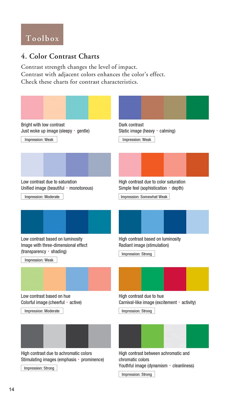
This book is wonderful and gives a systematic way of selecting and using colour based partly on the psychological and physiological effects of colour upon the viewer.The approach is not tied to the simplistic tyranny of the classic colour wheel, which can be very stultifying.The book explains and illustrates very clearly how colour and image are related. Dynamic effects, emphasis, accents, rhythm, prominance, multicolour unification, gentleness and traditional Japanese colours are all covered in depth.Warm, cool, intermediate, achromatic, metallic and neon colours are demonstrated in application clearly. There are colour contrast charts and a brilliant colour index which ascribes qualities of colours to group and name them. I know I am goingvto find this book very, very useful.The book is spiral bound, so it lays flat which is a huge plus. It has a rear fixed, outer card cover which protects the pages wellI cannot praise this book enough. Huge props to the author Haruyoshi Nagumo!
L**O
Not what I expected
This book had so many rave reviews that I decided to go with it but it wasn't what I expected. It's great that it's spiral bound because it opens flat when I'm using it. There is also much helpful information about each colour and combinations of colour that I found interesting. However, I really wanted more colour palettes to show and inspire combinations, and this book was very repetitive in that regard. I found that many of the patterns and examples are hard on they eyes rather than inspiring.
A**S
Useful addition to library
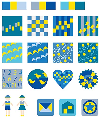
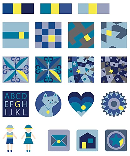
I really like this book for a number of reasons. Firstly, it's a compact size, around A5, and the spiral binding allows pages to lie flat.The layout takes a number of key colours, and shows them in different usage, e.g. high saturation, feature colour, muted etc. The variety of small pattern blocks using each palette are invaluable at assessing the effects relating to the physical area each shade occupies. While no means exhaustive, it certainly covers a wide variety of palettes and there is a section on metallics as well, which are true foiled print and not just an approximate ink shade.The palettes given throughout have a letter/number code which is easily looked up in the reference section at the beginning of the book. In the reference section, the "recipe" codes are given for both RGB and CMYK values, so any digital art program easily has the values inputted if you want specific colours, without having to search for a hex code or convert from Pantone.I have several books on colour for design, and I can see this one is going to be a staple for reference in my practice. Would recommend it to anyone in the design arena.
Trustpilot
3 days ago
1 week ago