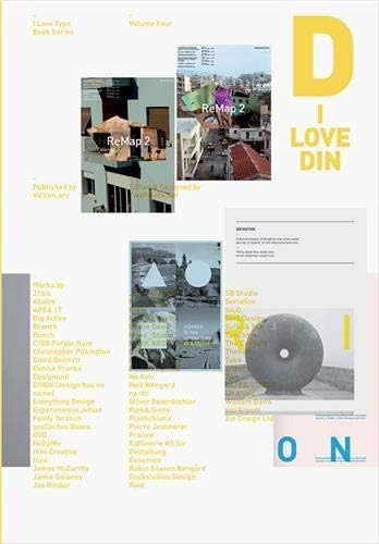
I Love Type 04: Din
Desertcart purchases this item on your behalf and handles shipping, customs, and support to Australia.
Description
Full description not available
Reviews
A**R
Like new
Loved it ❤️
M**I
interesting book book, now I have the complete series
easy view of all that you can do with this fontsalso interesting the other books of the same seriesbest price on Amazon!
A**K
in good packaging, works great
Item delivered on schedule, in good packaging, works great! Thanks!
L**R
These are good reads but considering type is so design led the ...
These are good reads but considering type is so design led the layout possibly could be better but thats not to say its god awful.If you want a good overview of a typeface or doing an essay on type and need to tie it together with a particular typeface these books are good for an overview. The main content however is eye candy with uses of the type, which is quite cool for designers for inspiration on how to use a particular typeface and the different moods the typeface can portray. It also shows how versatile one typeface can be.
W**A
Inspirationsquelle
Diese Rezension ist ähnlich der zur "I Love Type - Franklin Gothic"Während meines Moduls "Typografie" im Studium Mediendesign wurde mir das Buch "Bodoni" aus der Reihe vorgestellt. Ich war sofort fasziniert von dem Buch, bzw. von dem Inhalt der teils sehr gut gestalteten Seiten. Alle Bücher der Reihe sind sehr toll ausgestattet, sowohl was den Inhalt angeht als auch die Aufmachung. Wer sich nicht nur inspirieren möchte, der kann auch noch mehr über die vorgestellte Schrift erfahren.Leider finde ich dieses Buch nicht so gut gegenüber der "Bodoni" und "Franklin Gothic", da ich die Gestaltungsbeispiele dort teilweise aussagekräftiger sind.Für mich sind diese Bücher meist der erste Anhaltspunkt für Inspiration.
F**S
Din Dumb
This is a beautifully designed book and I got sucked in by the orange coloured edges, transparent ink used for the big D on the cover, silver foil stamped design credit and the use of DIN, one of my favourite typefaces, throughout. However, this book is disappointing for several reasons. First, there is not enough historical information about the origin and development of the DIN typeface with examples of how it has been used in industrial manufacturing and engineering in Germany. There are many examples of contemporary graphic designs that have used DIN with modest explanations from these designers about why they chose DIN, but these explanations are short and anecdotal and don't provide enough insight into why each designer chose this particular font. Many designers also selected their favourite individual letter from the DIN font but there is no explanation about why they chose the letter. So the end result is another bland anthology of current graphic design without much editorial rigor to explain the popularity of this typeface. Some analysis of the variations of the digital DIN typefaces that are available would also have been useful to design historians and graphic designers.
P**P
I Love DIN
Der Titel sagt alles über das Buch. Sämtliche Arbeiten, die mit der DIN erstellt wurden, finden hier Erwähnung. Das Buch befasst sich nicht mit der DIN an sich, sondern mit den Verwendungsmöglichkeiten. Poster, Bücher, Corporate Identity usw. Zudem gibt es ein Interview mit Albert-Jan Pool. Was kann einem mehr geboten werden?Des Weiteren hat das Buch sehr gut zu händelnde Ausmaße zum Lesen und ist sehr schön gestaltet (aber das erwartet man ja auch von TwoPoints.Net).
L**R
Und noch ein Buch dieser tollen Reihe
Die DIN zählt vermutlich zu einer der, gerade unter deutschen Grafikern, beliebtesten Schriften und so ist dieses Buch, das ausschließlich Projekte, die mit der DIN umgesetzt worden sind, zeigt, eine klare Empfehlung.
Common Questions
Trustpilot